Sharper investment planning

We have created a number of engaging investment tools for Aviva, helping their customers become more informed about their financial future.

Background

Aviva is one of the largest insurance companies in the world, with around 33 million customers across 16 countries.

Xwerx has been providing experience design and tool building services to its Irish operation since 2011. We have combined our deep understanding of user experience for Fintech with the playfulness demanded by Aviva’s brand. In doing so, we have created a series of engaging web tools that have helped to drive new business for Aviva Ireland.
Lean Design Process

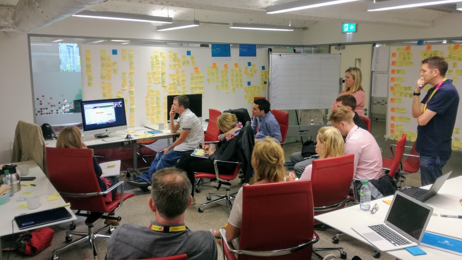
Our engagements with Aviva are driven by the principles of lean design – they are fast, iterative & collaborative.

We avoid heavy documentation, focussing instead on creating a product experience that’s underpinned by user feedback, customer needs and an openness to experimentation.

We have developed solutions for customers planning retirement, financial advisors seeking support to promote Aviva products and investors aiming to assess and compare the value for money of their investments.

Planning for the future

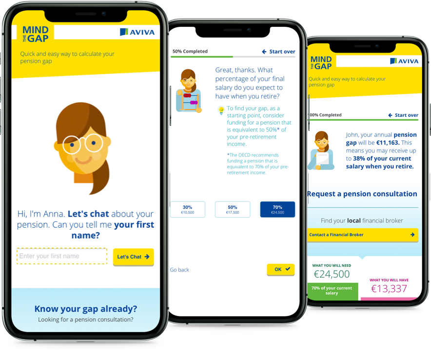
Mind the Pension Gap is an online calculator that helps people discover if they’ll have a gap in their pension funds when they retire. It is one of several retirement planning tools we have developed for Aviva since 2011.

The Results page is solution-focused. It offers several levels of engagement to users who can browse a concise summary of their findings, or have the figures emailed as a personal report for later consideration.

Customers who are motivated to take further action are invited to initiate contact with a local Financial Advisor. Search functionality allows them to find their nearest Financial Advisor (and Aviva partner) by sharing geolocation data from their phone or device.

A more enhanced version of the tool is also provided to Financial Advisors to allow them to give their clients a deeper insight into their retirement planning options.

Making the complex simple

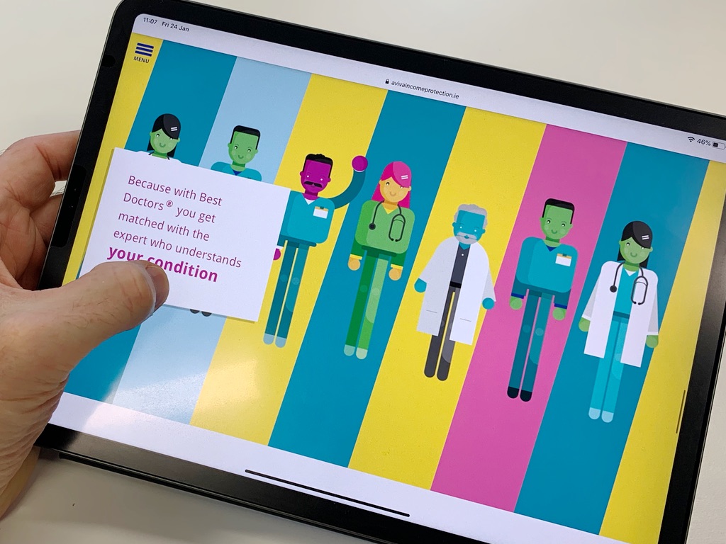
Aviva offers the Best Doctors service to all its protection customers. It needed a compelling message that customers could understand in an instant.

With the help of several customer-focused design sprints, we created a playful, visual story that conveys the power of Best Doctors with clarity and purpose. This became part of a suite of support tools, leveraged by financial advisors to promote Aviva’s protection options.

Best Doctors provides Aviva protection customers with access to over 50,000 medical experts around the world who are able to provide a second medical opinion in the event of serious illness.

Supporting investors

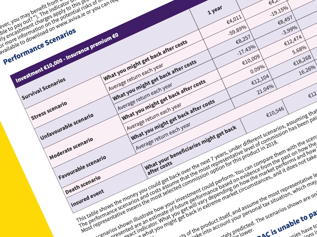
Recent EU regulations (PRIIPs and MIFID II) aim to help consumers assess and compare the value for money of their investments. Aviva’s Key Information Document (KID) tool meets this obligation by making it easier for customers to find and understand the products offered.

We worked with the Aviva team to create an online tool which Financial Advisors could use to help their customers make better investment decisions. Multiple search routes, vivid explainers and clear take-aways have made the experience a critical part of the Financial Advisors’ information toolkit.

What we did

User research
Prototyping
User testing
Experience design
Front-end development
Design sprint