Motion, focus, control.

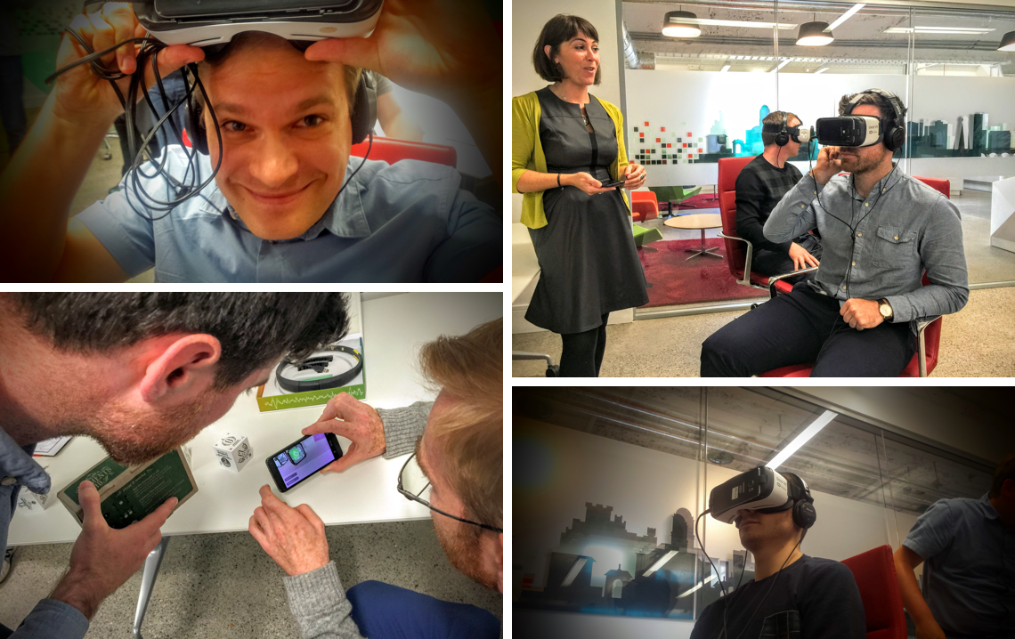
Let’s get our glasses on! The Xwerx team recently explored the user experience design challenges of Virtual Reality (VR).

Let’s get our glasses on! The Xwerx team recently explored the user experience design challenges of Virtual Reality (VR). We were guided in our discovery by Camille Donegan, founder of Alive-O Productions and organiser of a monthly Virtual Reality meetup at Filmbase.

Camille has an unconventional background, having conducted parallel careers in theatre production and IT. With VR, she believes she has found an ideal playground to marry technology and creativity. “This is the first time that a technology can literally put you in someone else’s shoes. It can be very emotional”, she says.
The next big computing platform

Virtual Reality is no longer “sci-fi”. A growing number of people have had a chance to try it, either during a public demo or with the super-affordable Google Cardboard option.

Areas of application are multiplying, from gaming to e-commerce, but also include productivity and enterprise software. “Headsets could be the office of the future”, predicts Donegan. According to a study by Delta Partners, VR and AR have the potential to become “the next big platforms”.

The dramatically altered office landscape as a result of the Covid-19 pandemic brings these opportunities sharply into focus. Once the dust settles and businesses begin to accept the new normal of socially distanced offices and remote working, Enterprise VR may have a critical role to play.

Experimental phase

But as these technologies mature, questions arise about how to design the new experiences that they support. If there are rules, they still have to be clarified and tested in a limitless number of contexts. “We are still in the experimental phase”, says Donegan. Headsets can be off-putting, navigation nauseous, interactions frustrating. In other words, VR needs better UX.

Which is exciting.

The Xwerx team recently explored the user experience design challenges of Virtual Reality (VR).

Equipped with Samsung Gear VR glasses, we were able to surf some waves, gatecrash a U2 jam session, “gaze” at a few items in a floating virtual menu and play some Augmented Reality educational games.

These are some of the lessons we’ve learned…

Motion

It’s hard not to laugh when you see a VR gamer walking on the spot like some sort of drunken zombie. Getting from point A to point B is not the most straightforward thing in the virtual world. Add the problem of “motion sickness” (the feeling caused by the lack of control of your body motion), and you’ll have an idea of the technical and design challenges that still need to be solved. The list of experimental “motion tracking” tools include Wii Balance and multi-directional treadmills. There are also virtual shortcuts: users pick a point on the horizon or on a mini-map, then get tele-transported to it (think of Google Street View). Handy … but not very “natural”.

Orientation and focus

These are some of the most basic rules of usability – you need to tell your users where they are and what they can do from their current location.

In 4D environments, however, guiding your users can be tricky. Can they figure out where to look and when? Visual and aural triggers – like animations and audio clues – are precious allies here, helping you to catch the user’s attention or make them look in a particular direction.

Controllers

With headsets covering their entire field of view, VR users can’t see the real world around them. A direct consequence is that they can’t see any physical controllers – like a keyboard or a remote control. New generation controllers adapt to that constraint with ergonomic shapes and a minimal number of controls. Also, VR experiences integrate UI elements such as virtual menus and dashboards. These have to be adapted to a 3D environment with volume and depth, and not distract the user.

Ergonomics

To optimise interactions that involve a 360-degree point of view, a designer needs to obey a couple of ergonomic principles.

The main rule?

“Think lazy”, says Camille Donegan.

VR offers a 94 degree field of view, but it’s better to keep it under 77 degrees to make sure users can look around comfortably. Up, stick to 20 degrees, down to 40 degrees. For close distance, half a meter is a minimum. Your users would get cross-eyed otherwise. Office ergonomics also apply in the real world: if your user is sitting, interacting with a virtual screen, make sure he looks downward between 15 and 50 degrees and with a 1.3 meter focus.

Take-aways

UX Designers will play a key role in the development of compelling virtual and augmented realities. It’s clear that most of the fundamental heuristics of good usability that we have been working with for over 20 years will continue to be relevant. However, the methods of applying these heuristic principles are inevitably going to change as we move towards the VR and AR space.

When we start to see products being developed for enterprise to a level beyond the research lab, the influence of UX Design will be critical in ensuring products are built to last beyond the initial novelty factor.